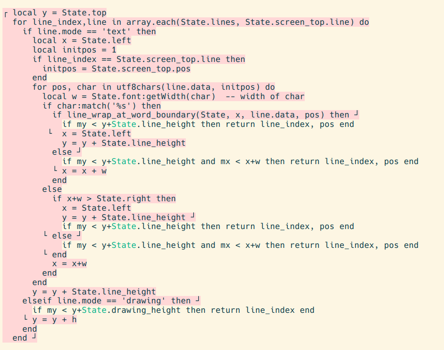
The code in the screenshot is a function to convert a mouse click (mx, my) into the location (line_index, pos) of the character at that point on the screen.
The problem is much of this function is boilerplate shared with several other places, such as the code to draw text on screen, compute the height of a wrapped line, etc. The boilerplate makes it difficult to see the business logic unique to this particular function, and so creates pressure to prematurely create an abstraction to "DRY things out". Highlighting the shape of the boilerplate in pink helps the eye to focus on the unique business logic in the protrusions, and so counters the pressure to hide the boilerplate before I've figured out the best way to do so.

(As an aside, this is an example of what I think of as "programmer-configured highlighting". We've gotten used to our editors deciding what to highlight for us, and we just pick the colors. One little tool I use everyday is the ability to highlight specific identifiers which flips this around: I pick a word, and the editor picks a color at random to highlight it with. And the highlight persists across sessions. The color of the State variable in the screenshot was selected in this manner.)
This post is part of my Freewheeling Apps Devlog.
Comments gratefully appreciated. Please send them to me by any method of your choice and I'll include them here.