The following program lets you scrub the mouse downward to find more and more precise approximations of π within the red optical sight in the center of the screen.
The following program lets you scrub the mouse downward to find more and more precise approximations of π within the red optical sight in the center of the screen.
To recap, you basically have a line of cells that can be in one of two states ('alive' or 'dead') and rules that decide how a cell's state evolves based on the state of its immediate neighbors to the left and right. The images below show a snapshot of time in a row of pixels, and time advancing from the top row of pixels to the bottom.
Starting from a single live cell, of the 256 rules 16 immediately wink out (empty grids in the picture below), 16 don't change (vertical lines), 48 move the cell (24 each to the left and right), 30 grow into triangles over time (6 each to the left and right and 18 on both), 18 form Sierpinski patterns and 22 are more chaotic. Here's a detail in Lua Carousel where you can see many of these types.
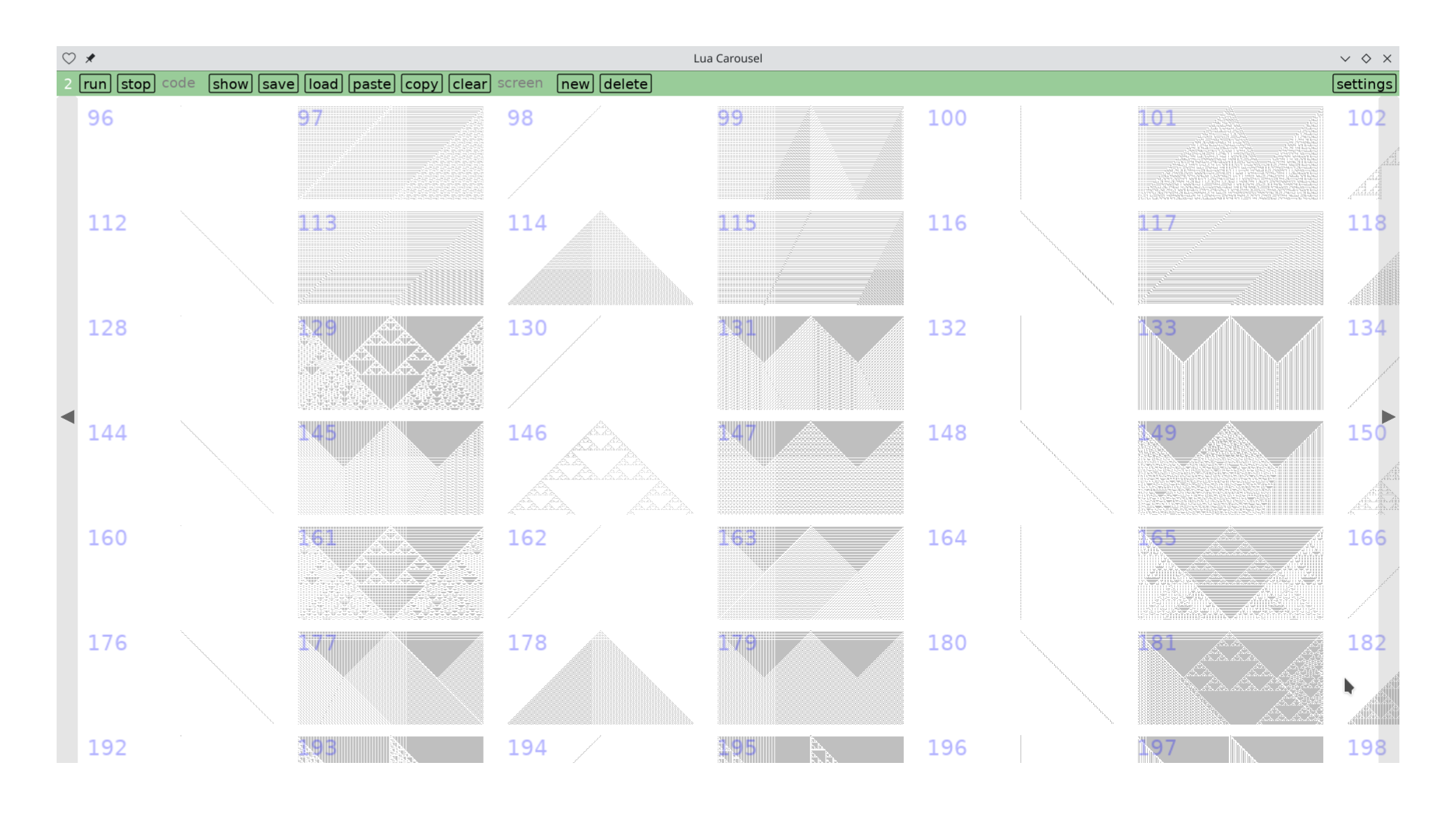
However, things look different if you start from a random configuration of live and dead cells. Seemingly well-behaved rules hide subtleties, and seeming patterns vanish. Read more →
(It's easy to get me to do something if it involves opening snap.love)
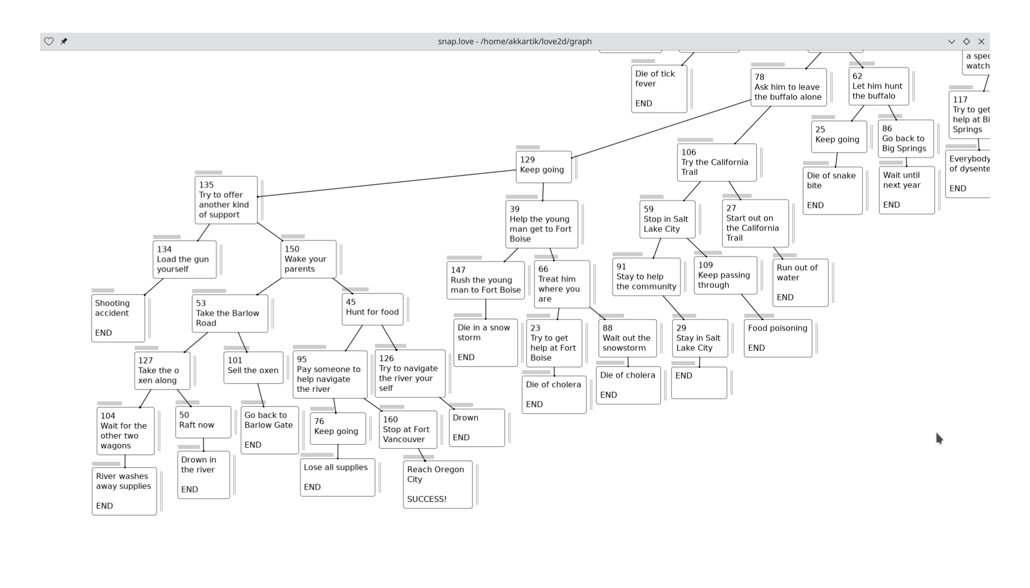
After finishing the map, I've been paying attention to the "meta game" of manually adjusting box positions and widths (height depends on amount of text) to make the arrangement pleasing to the eye. Constraints I've grown conscious of during this process:
I'd appreciate if anything seems jarring in this image, or if you have new OCD rules to infect me with :)
One frustration: I spent a while adjusting widths of boxes to not wrap lines within words, only to find that adjusting zoom messes things up again. This is an old problem: I can have precise scaling or crisp text, but not both. All my apps choose the latter.
Convolving a list with itself. Given a list[x1, x2, ..., xn−1, xn], wherenis unknown, construct[(x1, xn), (x2, xn−1), ..., (xn−1, x2), (xn, x1)]innrecursive calls.
And I am able to switch apps and solve it right on my phone, without needing to get out of bed.
I do have to put up with some klunky (Lua) syntax, though.
Looks like it's a fork of emscripten augmented to compile a whole OS kernel and userland. Includes raylib for graphics, and Lua bindings to it so I feel at home. Seems easy to build so I'm comfortable depending on the hosted version.
There's an app store anyone can publish apps to. Your changes remain in your browser's local storage until you publish them. All apps in the app store are mounted on the file system under /usr/store so it's easy to look at their source code.
Here's a port of one of my early LÖVE apps, for geometric constructions. It's on the app store so anyone should be able to run it just by clicking on this link.
Disclaimers. It's slow. Still lots of bugs. I had to reboot the VM several times while recording this video. Commands often hang or crash, then completely stop working until I reload. It's never lost my data, though. (Data is stored in local storage.)
"Add noise then quantize."

As background, you can click 'edit' on my Carousel-based .love files…
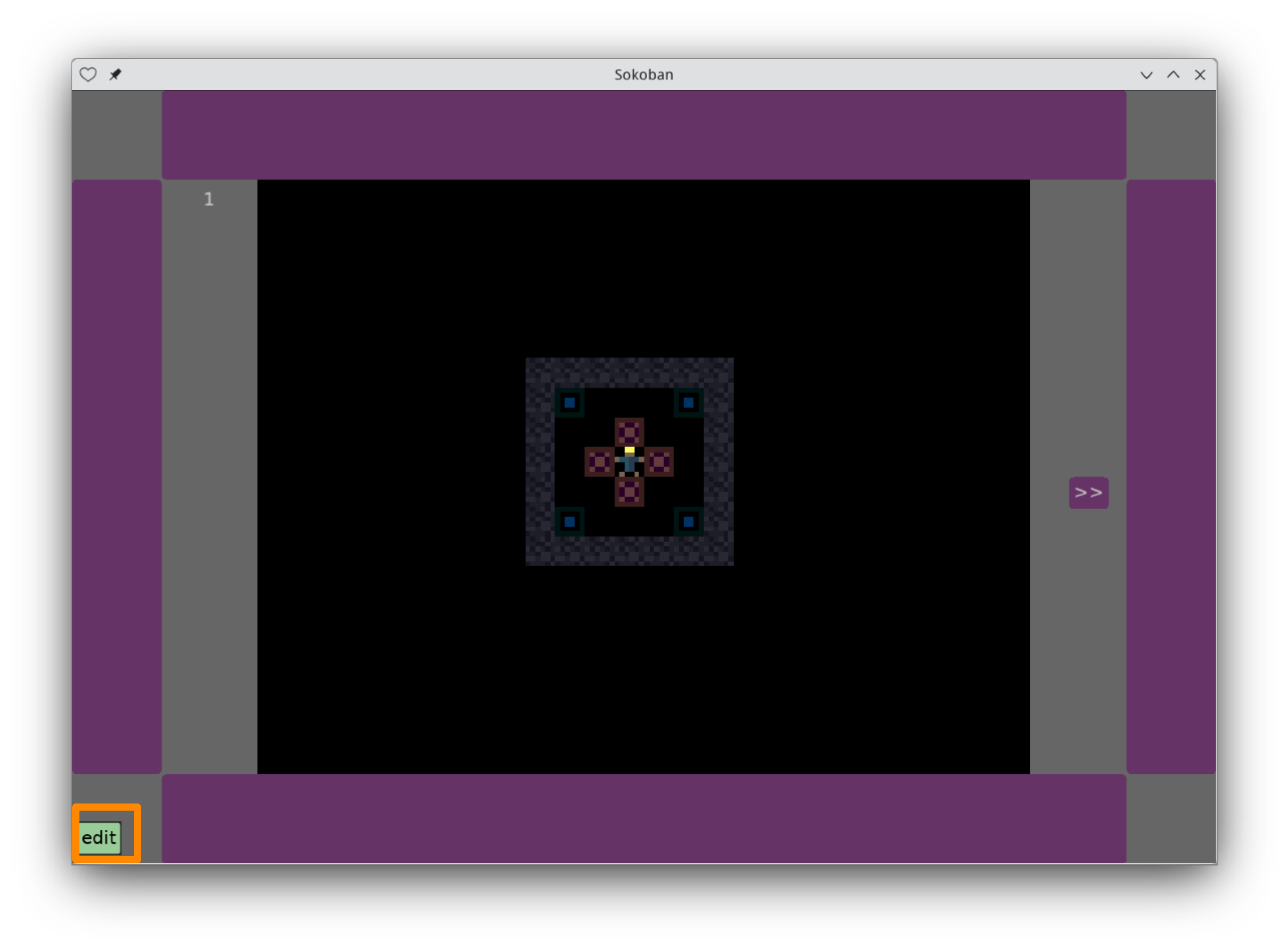
… to edit their source code right on your device, whether it's a computer or mobile device.
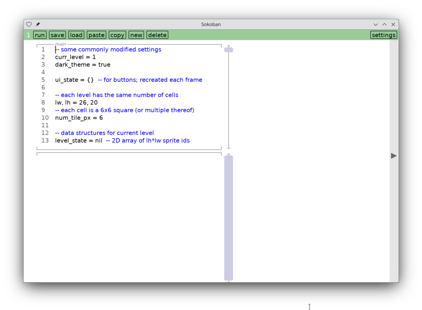
The question is how to preserve your edits in the face of changes to lower levels: either the LÖVE app or the .love file you're making changes to.
It seems to me one essential constraint of my platform choice is: upgrading the LÖVE app on a mobile device will blow away all installed .love files. Nothing I can do about this, and luckily LÖVE upgrades rarely enough that maybe we can live with that.
But it does mean we can't get too comfortable making edits on a mobile device. With that in mind, I'm trying out the following flow:
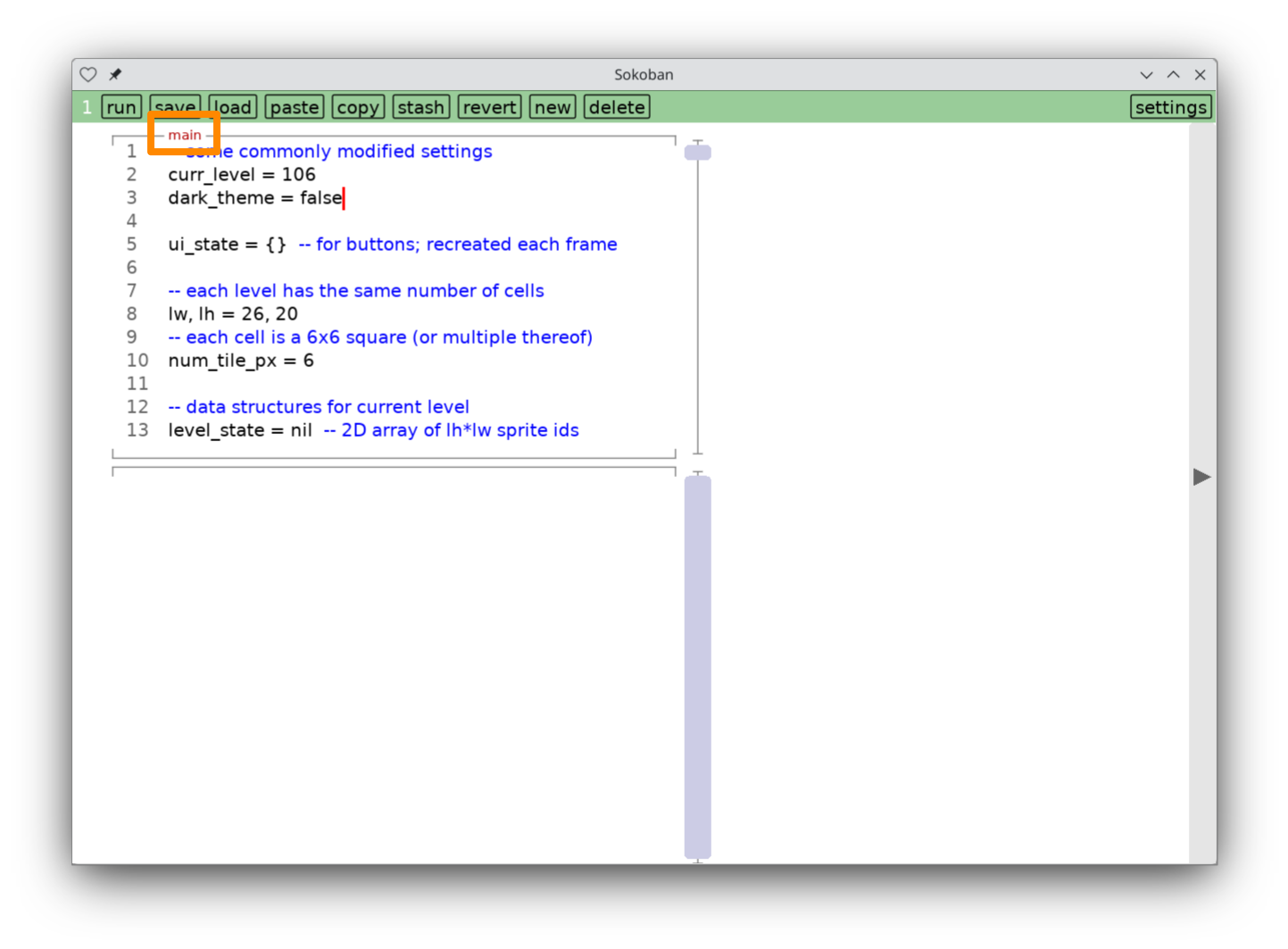
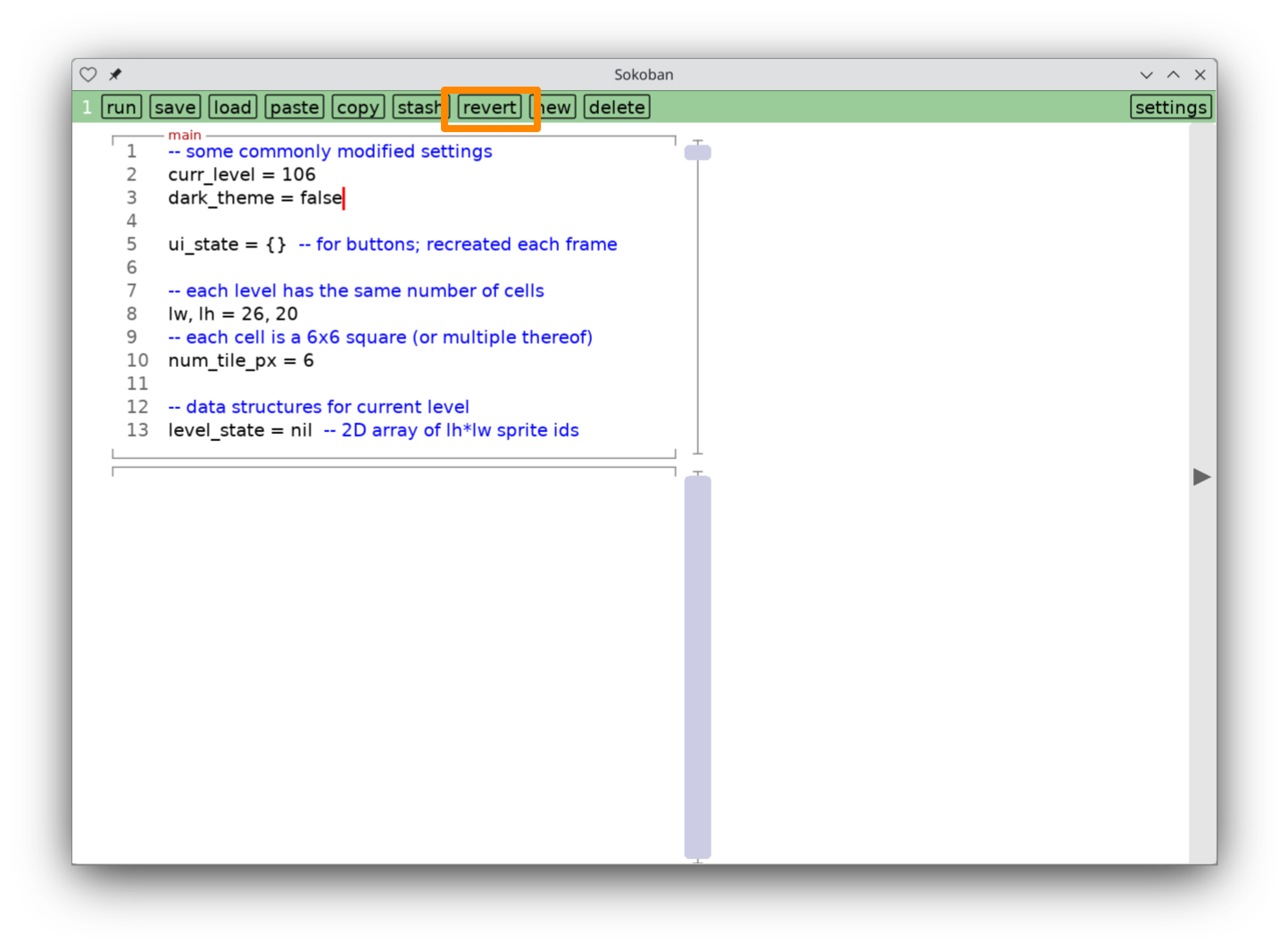

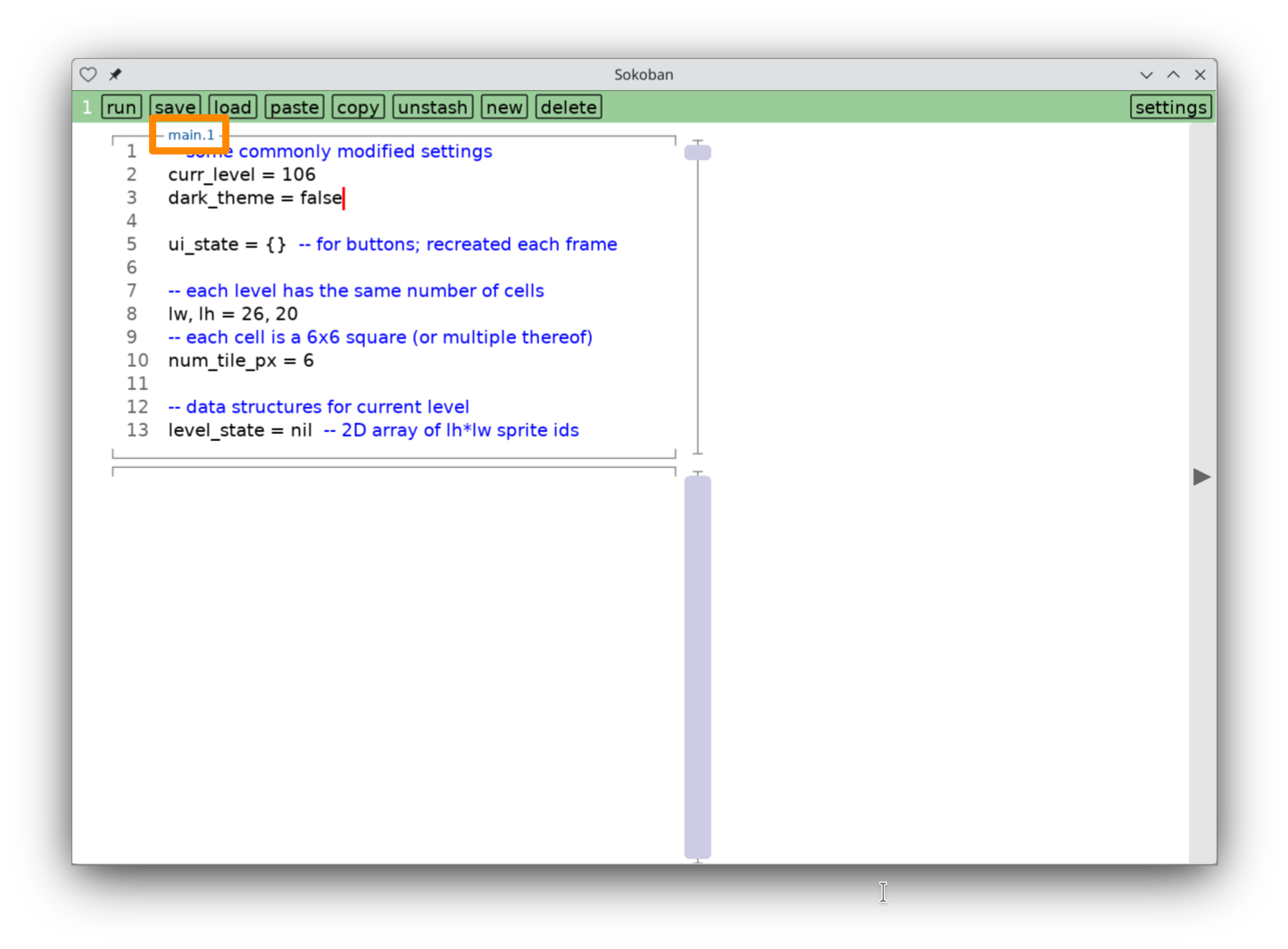
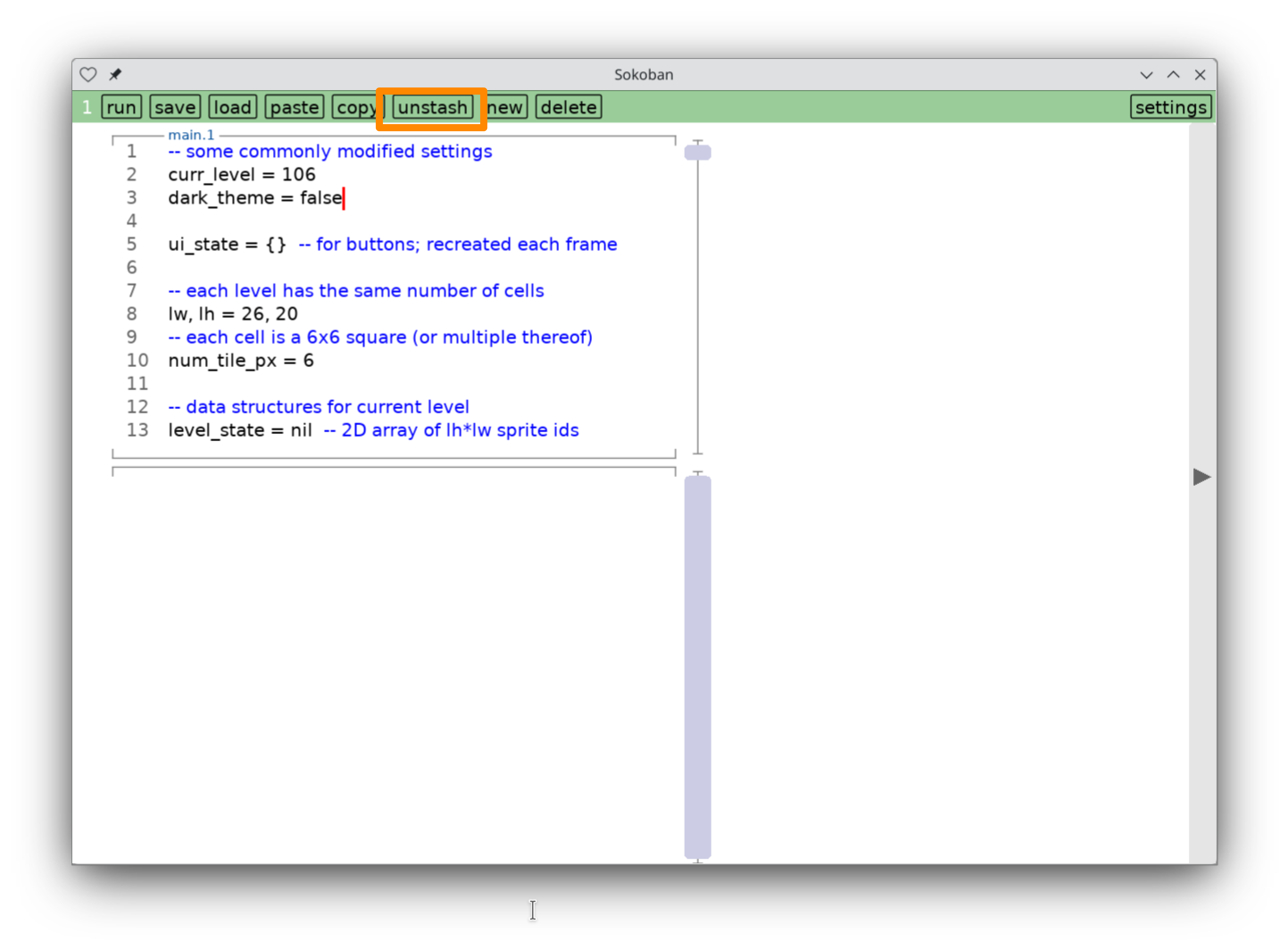
Still klunky, but feels like an improvement. And I'm trying to only show the new complexities when they're relevant, so most people won't have to care about them. Above all, the hope is that the red reminds people to not make too many changes on a mobile device.
And yes, I've been thinking about Ink & Switch all week. Perhaps this needs CRDTs and collaborative editing. But making it more friendly might encourage more changes than this platform can candidly handle, given the restrictions of mobile platforms.
I seldom mess with it, but today I modified it to show gridlines any time I drag things around. Should lead to neater maps!
Here's every possible rule for a one-dimensional (neighborhood-1) cellular automaton. All on a single infinite surface you can pan and zoom around on your touchscreen device. In 100 lines.
Read more on the Lua Carousel devlog.